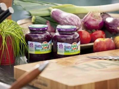
Canned vegetables manufacturer HAK is giving all the products in the HAK range a new label. The iconic red and green logo is also being updated. The company is responding in this way to growing consumer demand for honest and authentic products in packaging that provides clear information
Erik de Graaf, Creative Director & Partner at the well-known design agency Millford Brand Identity based in Leiden, the Netherlands, says the new design signifies more than only the origins of natural products (fresh from the land) and HAK’s care and quality. ‘The new logo is based on “no-nonsense and back to the basis”. This means no unnatural elements and only natural colours. We opted for a minimalistic design for the label. It features maximum visibility and an optimum fresh experience of the product, adorned with water colour illustrations by Carolyn Jenkins. These illustrations depict the contents of the jar in a way that is virtually true to nature, which places the focus on the products’ natural origins.’
Nicole Freid, Director of Marketing & Innovation at HAK, is convinced the new branding provides an opportunity to further increase the visibility and findability on the shelf. ‘We know people use the familiar HAK logo to navigate within the shelf. We’ve improved this further by making the label less cluttered: there are fewer messages and the logo is more prominently visible. Less is more’, says Freid.
In addition to the complete re-design of the logo and the label showcased on the front of the products, the back label has also evolved. HAK will now state explicitly on the back how many natural sugars the products contain.
- Read the full profile of HAK